Why is Tableau the best tool for data visualization?
Jagadeesan
4 mins

Data is king.
Companies need data to help understand the market, product acceptance, sales, fraud detection, and campaign management. While there is no dearth of data to explore, assessing such large volumes without a structure is extremely difficult.
What is Tableau?
Tableau is a visual analytics platform that helps users make sense of data and deploy it to solve organization-wide problems. The BI tool helps explore and manage data more efficiently, impacting business decisions significantly.
Companies like Walmart, with 2300000 employees and revenue of $572.75 billion, and Cardinal Health, Inc., a United States based Healthcare organization with 46500 employees and revenues of $181.36 billion, respectively, have massive data points and use Tableau to automate their data organization and management.
How can the Tableau data visualization tool help businesses?
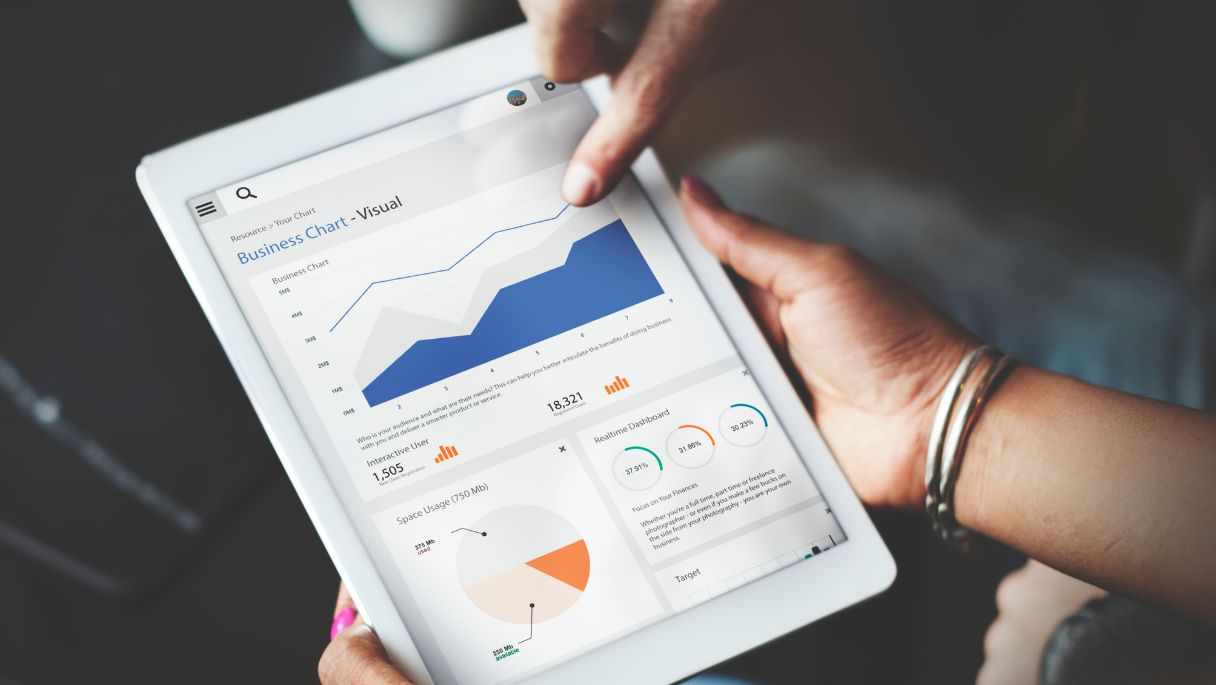
One of the most significant advantages Tableau offers is its ability to visualize the data at hand and present it in a comprehensible manner. For this, the platform uses machine learning, statistics, natural language, and data prep for detailed insights in a quick turnaround time.
Users can plot bar charts, pie charts, bubble charts, heat maps, tree maps, and even scatter maps on geographical maps. With tableau, you can also break down data to micro levels using a filter and visualize it at a granular level.
Here some of the benefits of using tableau for data visualization:
1. Ease of use
On average, a user requires three to six months to learn even the most advanced Tableau features. The BI tool is flexible and can easily integrate with existing workspaces, making it a familiar tool for most.
Since the platform is made to help with data visualization, it does not have complicated widgets or features. Tableau offers data analysis and results in a quick and iterative manner that paves the way for immediate feedback, thus closing the loop of a long approval cycle.
Tableau also allows collaboration, making data sharing more effortless, engaging, and understandable. From data scientists to business owners, everyone can use Tableau for their data prep.
2. Low cost
For enterprises diving into high data volumes and multiple data points, Tableau is a cost-effective solution. Since it works well across a wide range of functionalities, integrations, and analyses, enterprise-level organizations with multiple organs are more likely to use this platform to its full potential.
However, it might not be very cost-efficient for individual users.
3. Handles large amounts of data
Data extraction takes ages, but Tableau takes care of that. However, the platform questions the data type, complexity, calculations, etc. Users can make data handling easier with Tableau by removing irrelevant data files from the set and prepare before it is fed into the platform. Tableau’s functionality, Data Interpreter, helps clean imported data and remove unnecessary information not required in the dataset.
Most users feed sheets, data sources, and dashboards in the Tableau workbook (data book). While this may help momentarily, blending data from multiple resources will not offer an accurate representation or help with the overall purpose. The trick is to visualize the Tableau workbook beforehand and keep it bite-sized to enable better visualization and reports.
Note: While Tableau has data preparedness features, it does a much better job visualizing when the inputs fed are sorted beforehand.

4. Mobile-friendly
Tableau is very responsive. Since the clientele often works on their mobile. Tableau has built a mobile-friendly application that allows users to check their data on the go. There are no additional steps when viewing dashboards on their mobile. Since most smartphones are touch-based, the features are touch-optimized, making it easier to move through different reports and insights.
5. Better visual representation
Data visualization in tableau offers an intuitive visual experience that allows users to explore their data without losing touch with their analysis. Based on the right target audience, Tableau offers users a variety of options when it comes to data representation. It helps users arrange their data in a more legible pattern. For instance, side graphs work well when it comes to representing YOY growth, thus, enabling a clear understanding of the said data.
Tableau also allows users to deploy color cues to make their data representation more attention-grabbing. Reports on climate change can be easily represented via color and help users quickly make sense of the information at a glance. Tableau users can also integrate visual icons and typography in their reports for a more quirky audience and market.
6. Integrates with a scripting language
In many cases, integration between Tableau and scripting languages requires external extensions. The most common integrations are between Tableau and R, Python, and MATLAB, which helps integrate and visualize data from the said languages easily.
For instance, the integration between Python and Tableau, also known as the TabPy framework, allows Tableau to remotely execute Python code. It enables authoring calculated fields in Python. Similarly, users can import R packages or data models into Tableau effectively.
Conclusion
Tableau is great for having all your data in one place and represented in engaging formats that offer real-time actionable insights. Companies can also leverage the added benefits of integrations that can enhance the experience and simplify data extraction.
Our Tableau experts can help you make sense of your data in real-time while focusing on your operations.
Stay up-to-date with the latest insights and news from Sedin
Subscribe to email updates